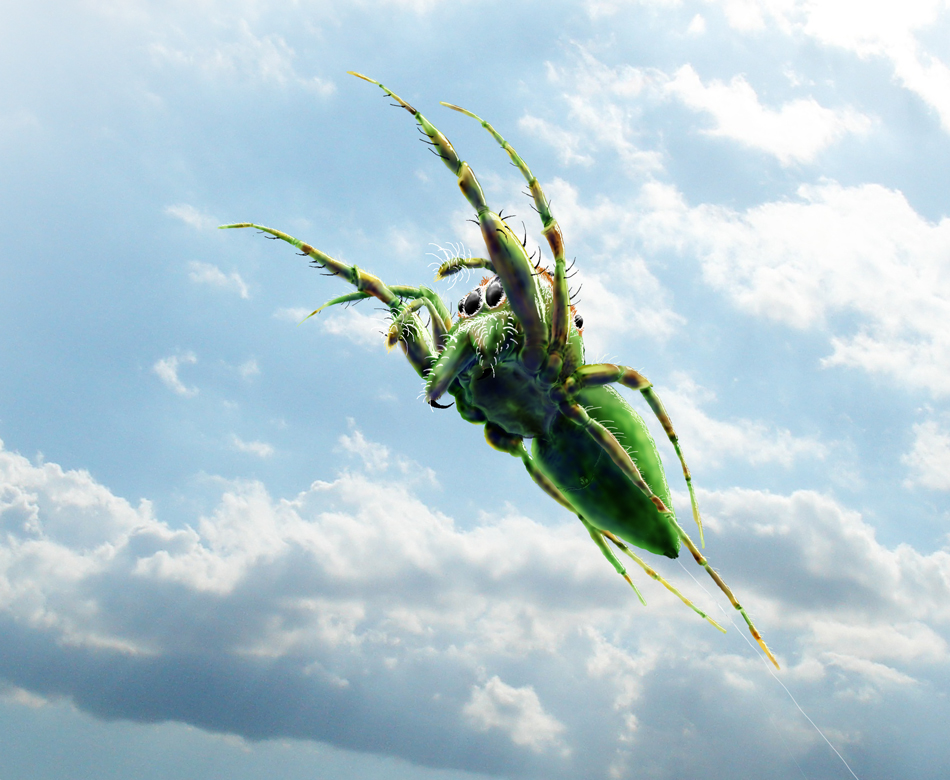
by Marlin Peterson | Mar 31, 2010 | Science Illustrations
I did this image of a salticid, (also known as a jumping spider), in mid flight. What is coolest about it is that it is from a vantage point that you could never really photograph. They are one of the many cool spiders that DO NOT make webs to catch prey, but are...
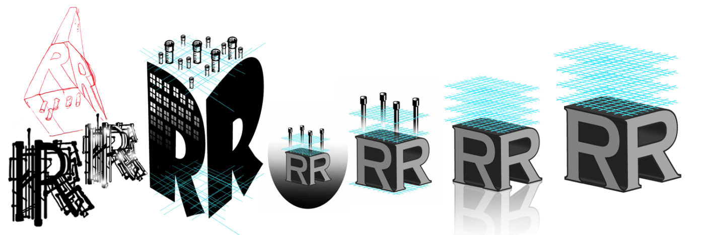
by Marlin Peterson | Mar 30, 2010 | Science Illustrations
This series of R’s is the evolution of a logo I designed for a client called Rev’t Resource. It is a company that does the engineering busy work for the pipe and duct systems in buildings. Pipes, blueprints, and 3-dimensional were the themes to employ. ...
